
For Sottobosco Paoli, a high-quality artisanal food producer in Trentino, I was commissioned to develop new visual and strategic assets, centred on packaging and communication for both their traditional preserves and a new range of products.
The project spans:
Fruits illustrations and more
Total rebranding of the labels for compotes and extra jam
Packaging concepts for a 3-jar gift set
Naming and positioning support for new product lines
Messaging and brand narrative refinement
The work emphasizes authenticity, natural ingredients, and refined visual storytelling, while aligning with the brand’s artisan roots and future export ambitions.
Illustrations
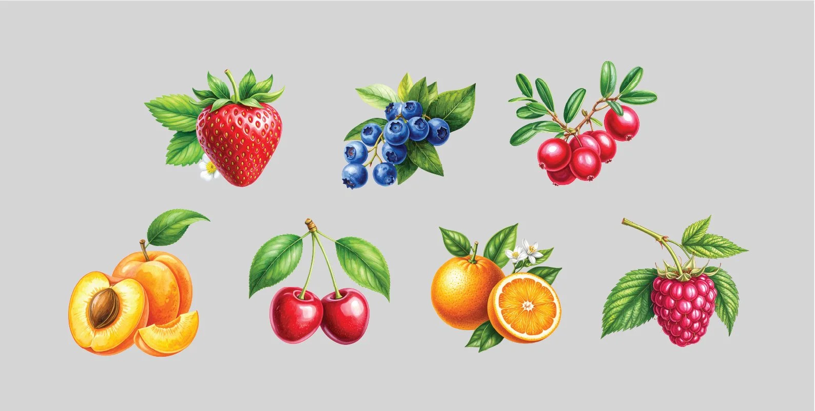
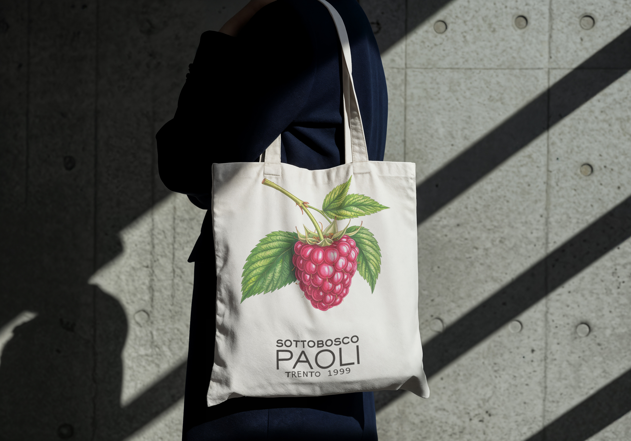
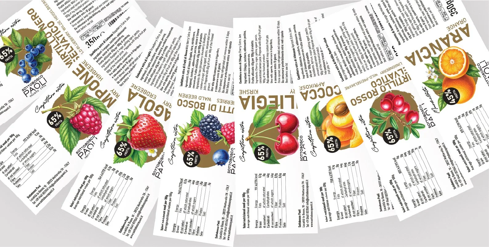
For Sottobosco Paoli, I created a set of illustrations designed to be used both across advertising campaigns and product labels. The collection includes strawberry, blueberry, cranberry, apricot, cherry, orange, and raspberry.
The brand’s previous labels featured abstract, non-realistic imagery. My goal was to shift towards a more natural and tangible visual language, inspired by traditional botanical illustrations, reminiscent of old herbal manuals, where nature was observed with care and respect. This approach aligns closely with Sottobosco Paoli’s philosophy of working attentively with natural ingredients and processes.
Each illustration was developed through a hybrid process: starting from hand-drawn sketches, refined digitally, and then enhanced with the support of AI tools to achieve a cohesive, slightly vintage aesthetic.
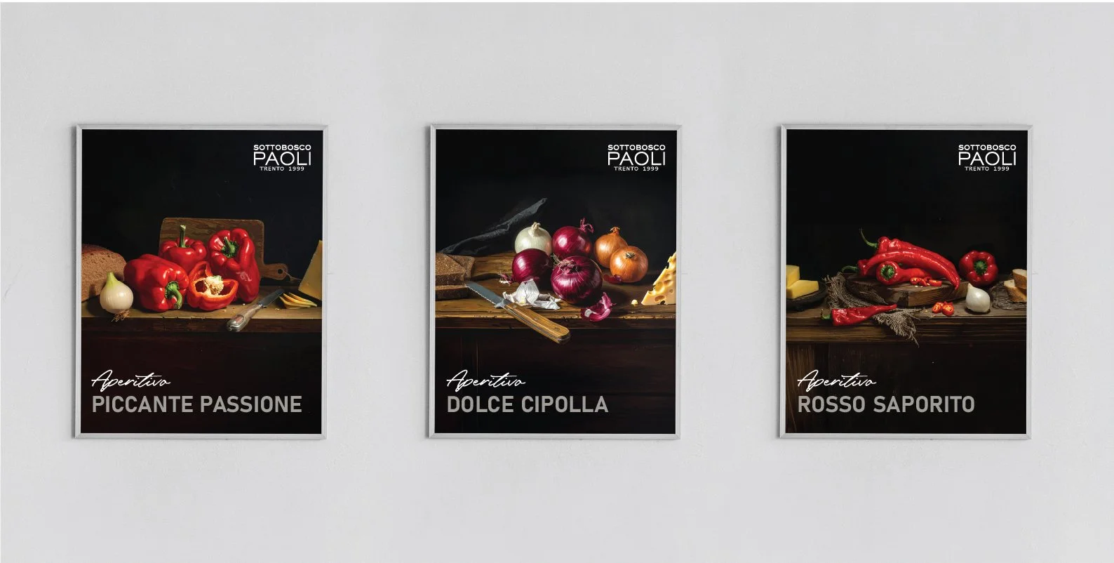
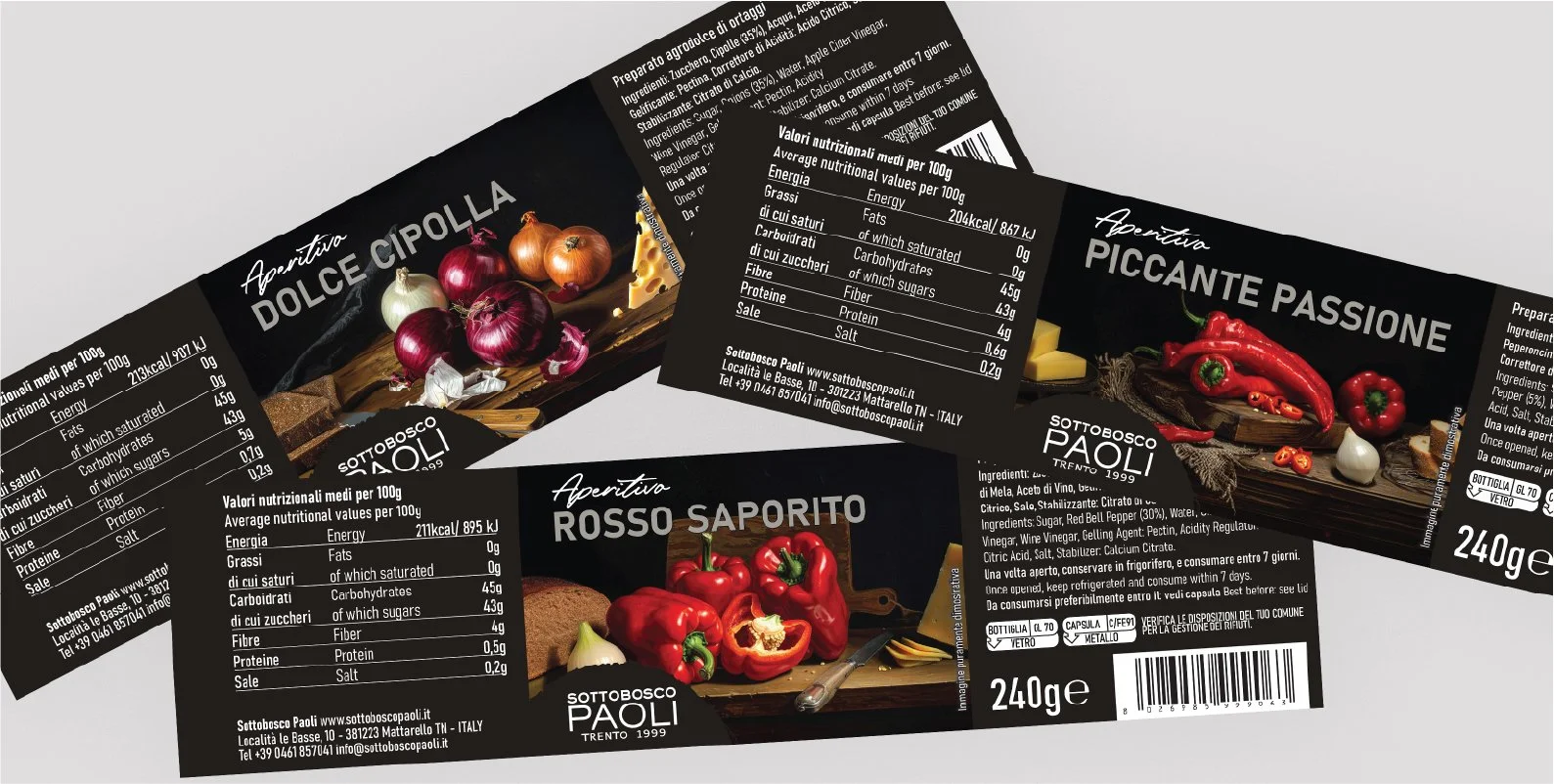
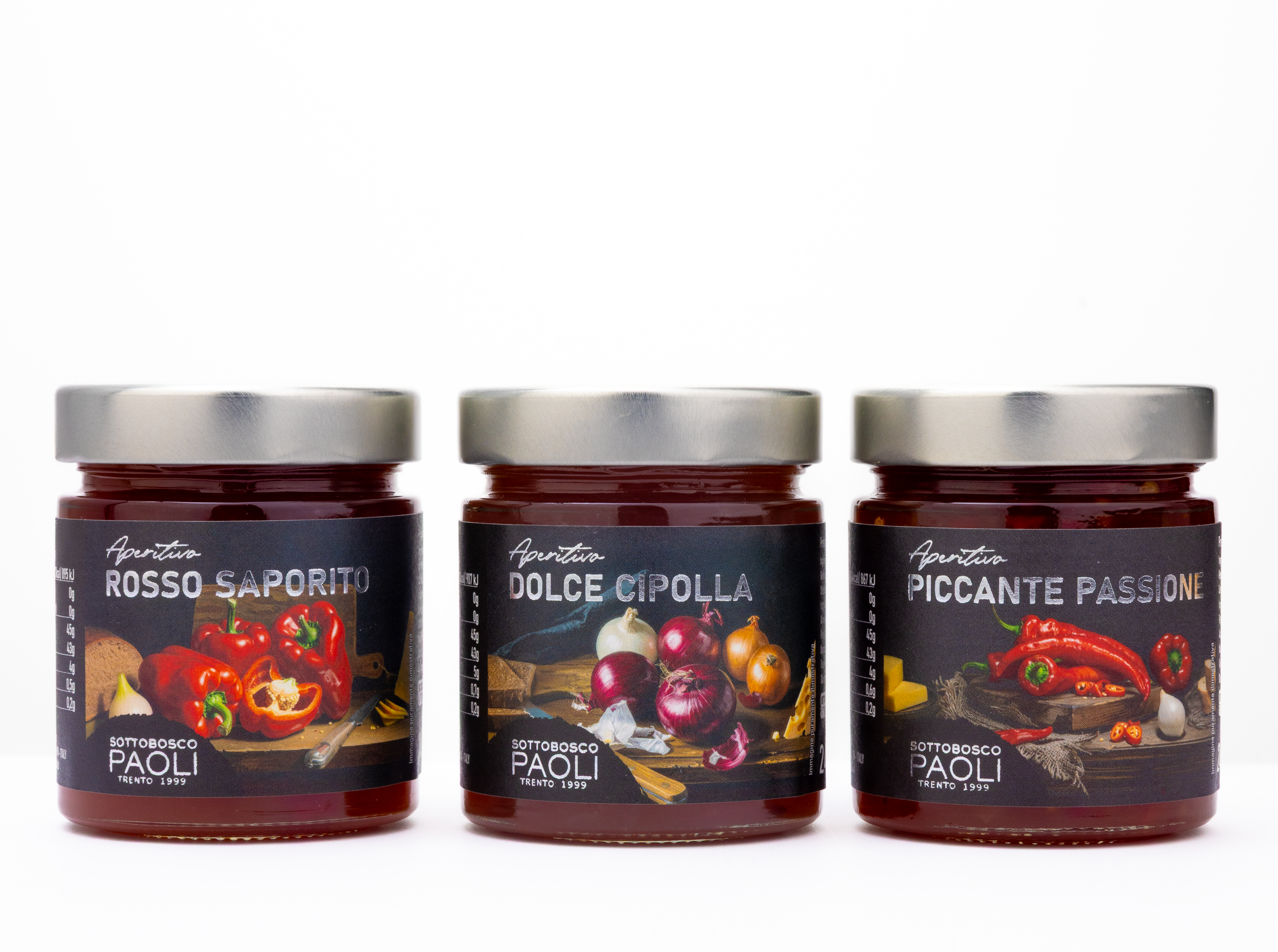
I applied a similar approach to the savoury line, taking inspiration from the dramatic visual language of Caravaggio. His work is known for the use of chiaroscuro — a strong contrast between light and dark used to create depth, realism, and emotional intensity.
In these illustrations, the ingredients emerge from darkness as if illuminated on a table, almost like a still life prepared for tasting. This lighting creates a sense of focus and intimacy, elevating simple ingredients into something more refined and expressive.
The intention was to present these sauces as genuine and distinctive — not just products, but small, curated experiences that feel both authentic and slightly theatrical.
Illustrations
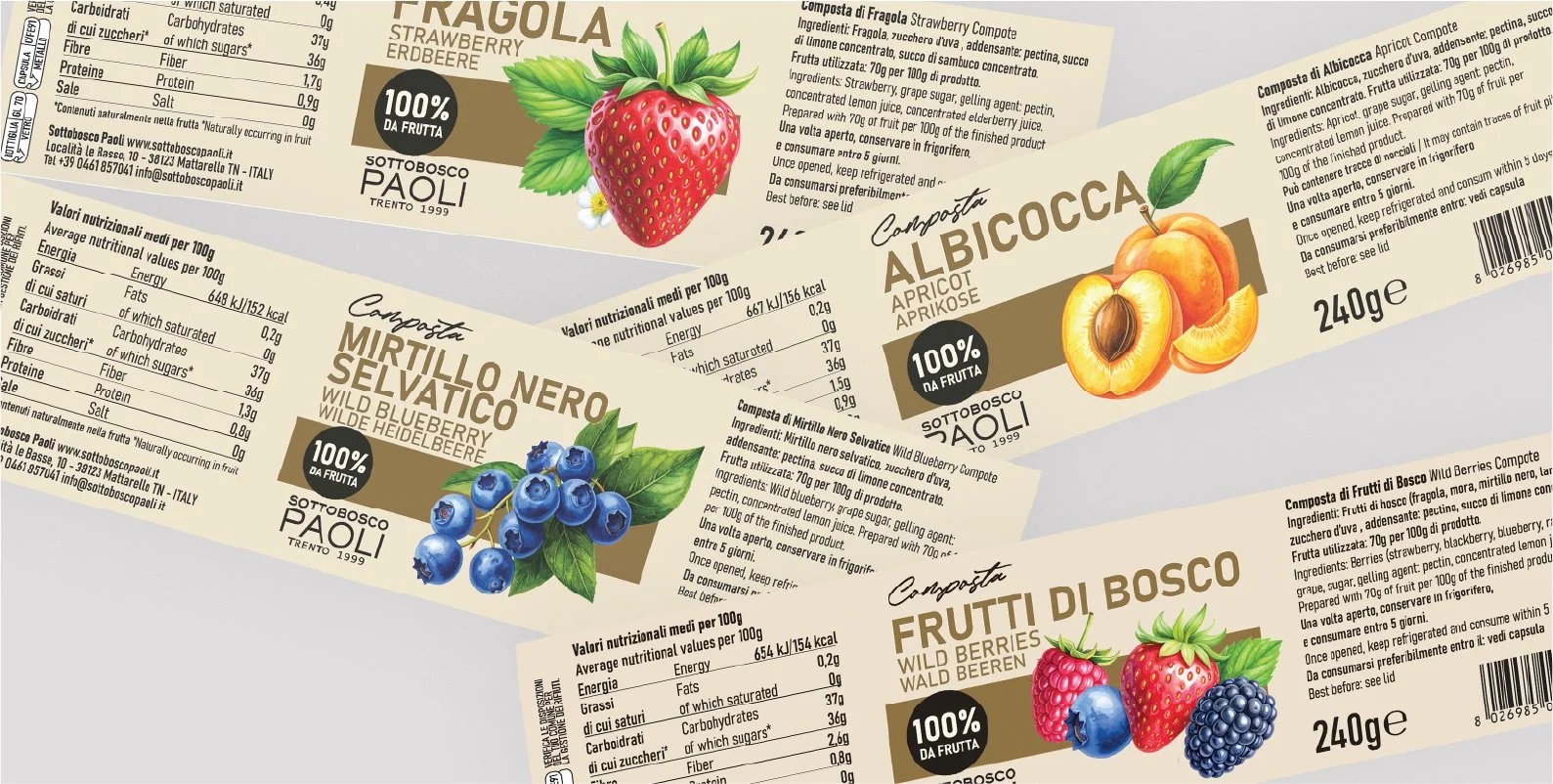
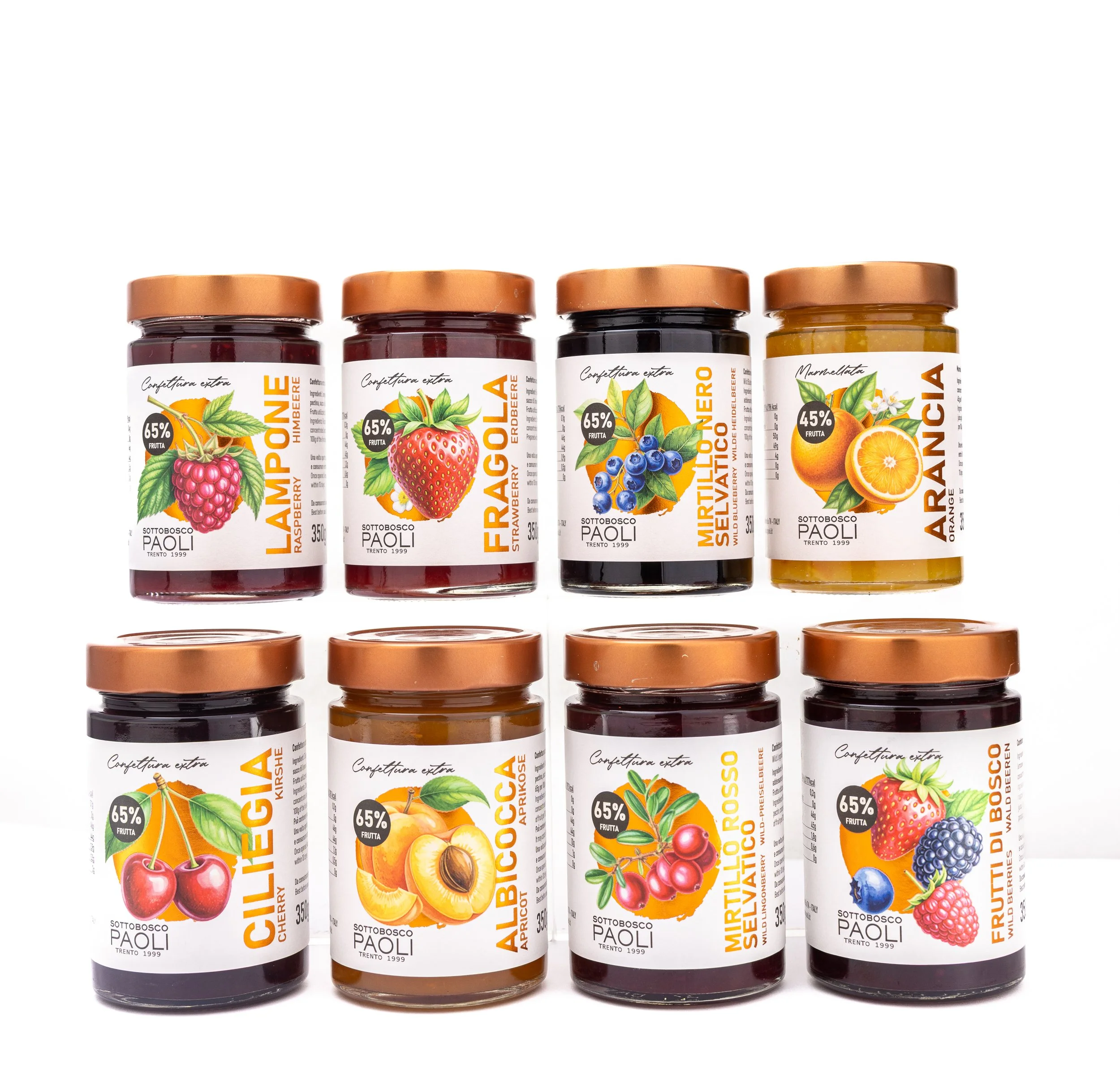
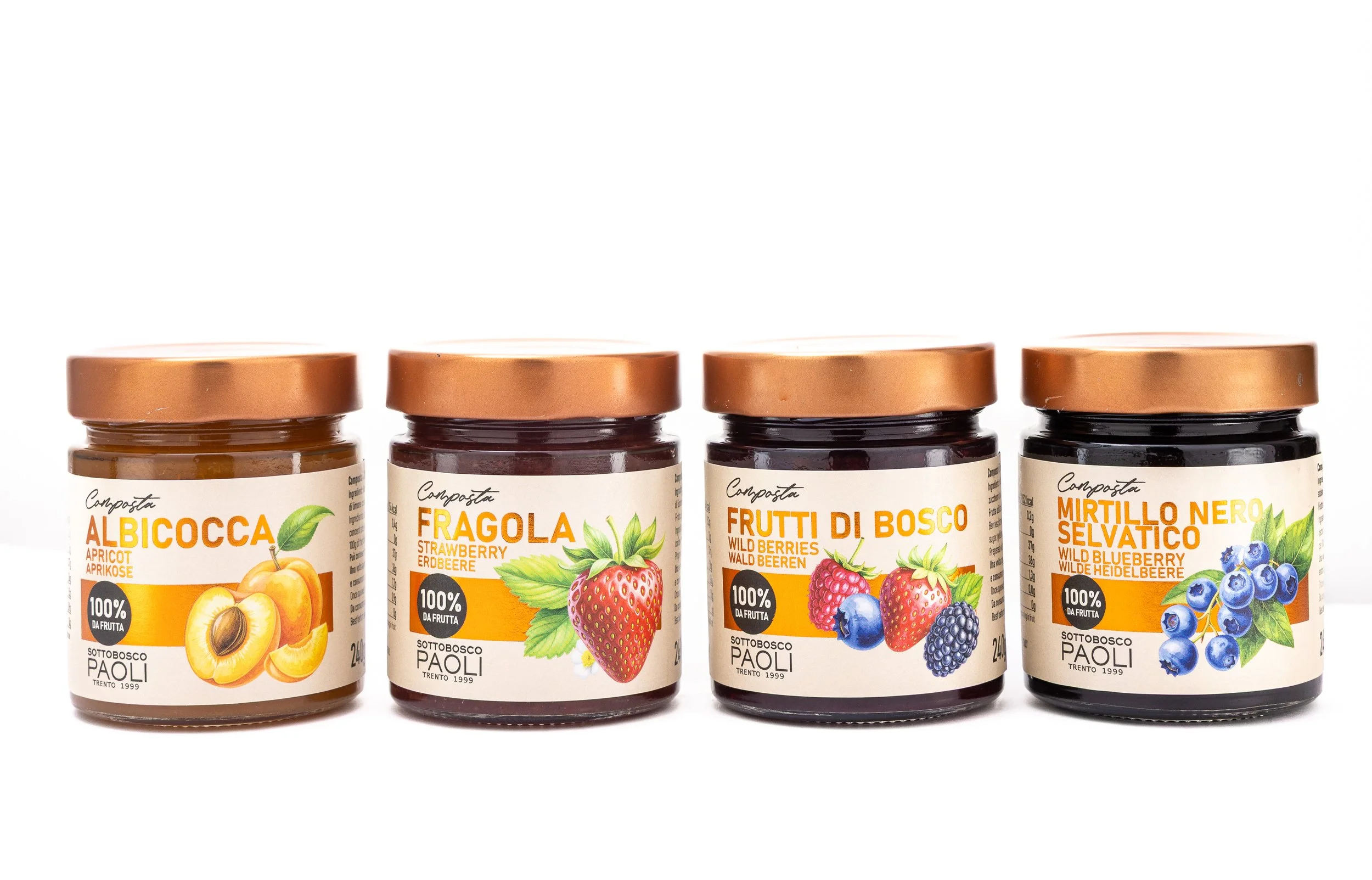
One of the main challenges in designing the labels for Sottobosco Paoli was to clearly differentiate the various product lines. While the compotes represent the most premium offering within the sweet range, the extra jams are equally rich and expressive in flavour, and deserve the same level of visual attention.
What makes working with this brand particularly interesting is the level of transparency their products allow. Quality is not just a positioning; it is a given, and it needs to be communicated honestly and consistently. With products made with high fruit content, often reaching 75% or more, and without preservatives or colourants, the design had to reflect this authenticity without overstatement.
Sustainability was also a key consideration. Choosing non-recyclable materials was never an option; instead, the challenge was to create a premium feel while respecting the natural values of the brand.
In contrast, the savoury line required a completely different approach. It needed to stand apart — to break away from the visual language of the sweet products. We chose a dark, almost dramatic label: deep black tones, strong contrasts, and a more expressive identity designed to shift perception and redefine expectations.
The goal was to create something bold and distinctive — a visual language that feels disruptive, confident, and unmistakably different from competitors.
Booklet
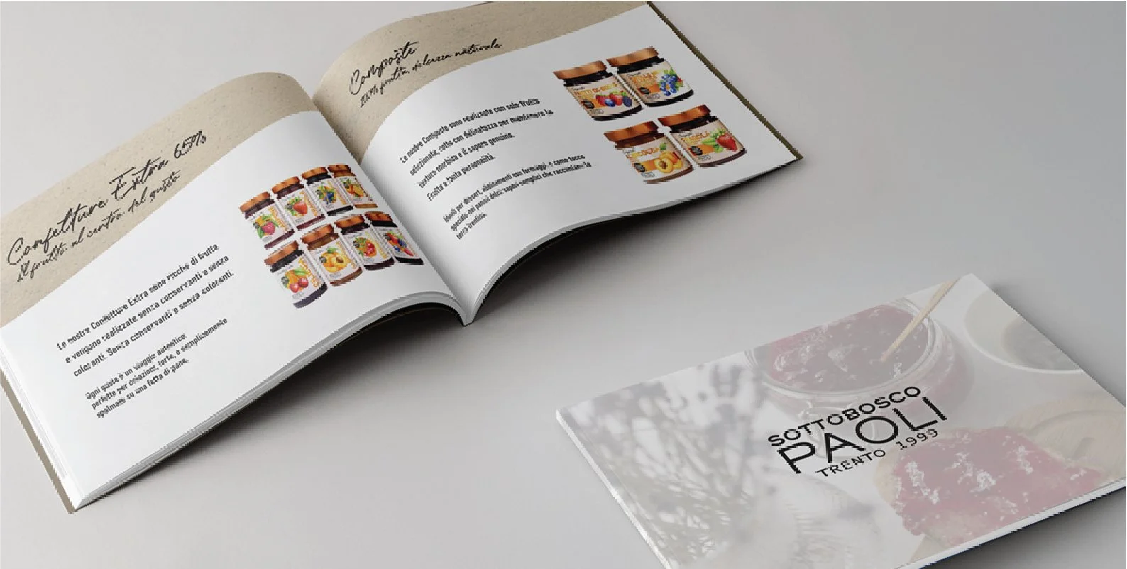
Sottobosco Paoli is exactly the kind of client I love working with: people who still believe that flipping through is more meaningful than scrolling.
They value direct, tangible communication: putting something physical into their clients' hands. Something that can be touched, felt, and experienced — a gesture that reflects care, attention, and respect.
In a world dominated by digital content, physical materials still create a deeper emotional connection and a more lasting impression, engaging not only visually but also through touch.
For this reason, we decided to design a brochure that could truly represent the brand:
a tool to introduce Sottobosco Paoli to new audiences while presenting their new product lines with a refreshed visual language and new ideas.
More than a brochure, it becomes something to keep, a small, curated piece of the brand itself.
Packaging
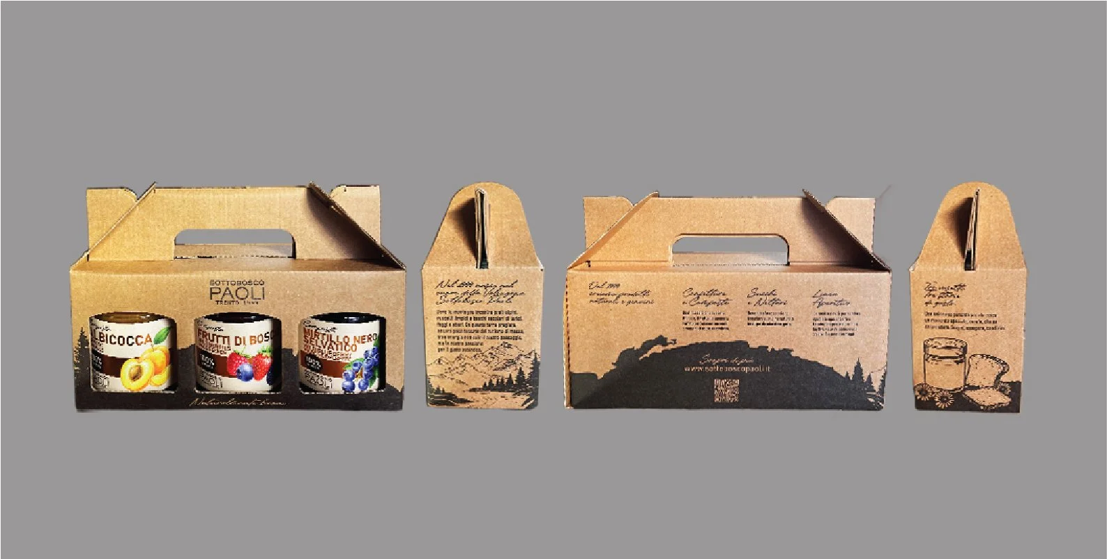
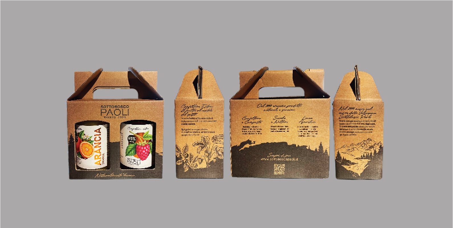
Not only labels, but also an extended packaging system designed to bring products together. The concept allows for different combinations: three jars of jams, three savoury sauces, or two extra jams in a larger format.
To highlight the beauty of the labels, especially their bronze detailing, the packaging was intentionally kept minimal and tactile. We chose recycled paper, both for sustainability and for its natural texture, enhancing the overall sensory experience.
The illustrations are simple and narrative-driven, reflecting the brand’s roots: the mountains, and the quiet ritual of a picnic. A moment of pause, of sharing, of connection.
This packaging is designed as a gift not just a container, but an invitation to discover and share a curated selection of flavors.